How Wes Anderson Is The Most Stylistically Influential Director Of His Generation
A favorite conversation among film geeks is which Wes Anderson movie is the best. I love this conversation because there is so much to love about all of them and you can’t really argue with someone who picks Rushmore or The Royal Tenenbaums
or The Grand Budapest Hotel. So really the conversation is less about competition and more about how one particular movie in this director’s filmography affected someone personally, how one particular angle of Anderson’s vision hit that person squarely in the face because of where or when or who they were at that moment in their lives.
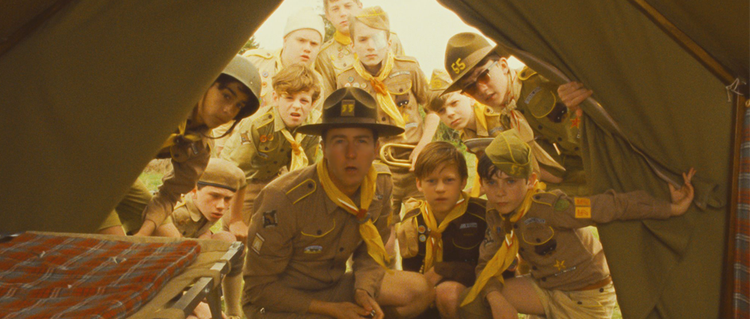
Some people consider Wes Anderson a genius, subverting traditional film language while creating his own dialect. Others consider his films artfulness mistaken for art, devoid of meaning. I am a big fan of most of Anderson’s films, mostly because every single frame of his films is absolutely thrilling. Each moment is a joyous treat of color, character, sound and symmetry. His popularity is from his incredibly distinctive filmmaking style. Each part of his films seems to be part of his signature.
When watching Anderson’s films, one basic thread throughout his films is instantly identifiable and it requires no formal analysis to understand. Anderson continually features familiar faces in his films. Bill Murray and Owen Wilson are both involved in all but one of his eight major motion pictures. Wilson isn’t shown in Rushmore, but he did co-write the screenplay with Anderson. Other collaborators include Jason Schwartzman, Luke Wilson, and Anjelica Huston. The Grand Budapest Hotel not only has Schwartzman, Owen Wilson, and Murray, it also stars Adrien Brody, Willem Dafoe, Tilda Swinton and Edward Norton, all of whom now have two to three Anderson credits under their belts.
A prominent part of what makes his directing style really distinctive is the usage of the color palettes. Anderson’s use of color is the most obvious component to his style because it is so prevalent in every scene. It is the most striking of his trademarks. An entire Tumblr page is dedicated to the color palettes in his films (!). The colors create the tone of the world Anderson has created for each film. It intrigues the eye and invites the viewer to go on a visual rollercoaster as each frame is filled with dozens of saturated colors — mostly red, yellow and blue — to gawk at. The Grand Budapest Hotel interestingly uses color to distinguish the three different time periods that take place in the film. The 1930s, where a majority of the action takes place, are full of very saturated reds, purples, and pinks. Even his use of white is visually striking. The 1960s feature yellows, greens, and golds. Lastly, the 1980s seem more natural and unedited.
With each new film, Anderson has been able to exercise more and more creative control over the worlds he is depicting, and whether that is the result of budget or not, the result is a director who has taken his own personal aesthetic and made it part of the culture, and that is no small achievement.
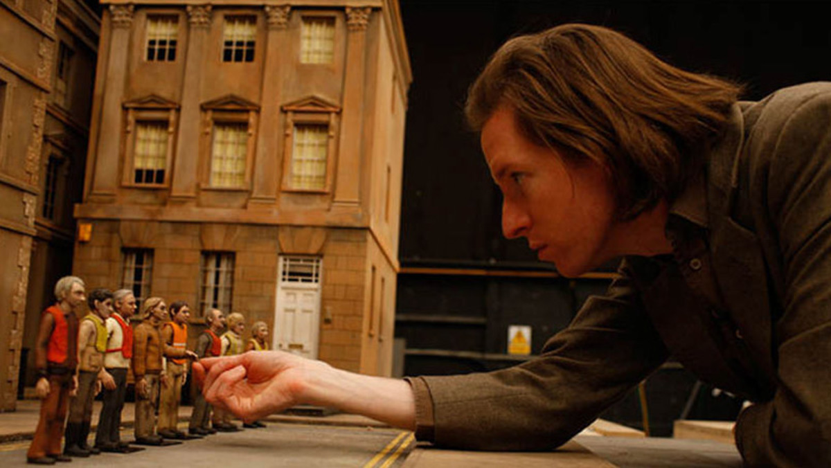
Be sure to anticipate the director’s upcoming stop-motion animated film Isle of Dogs, which opens in theaters next year on March 23rd.
Post a comment